1. Start with the viewing distance, not the artwork
Readable signs begin with where people will see them from. A shopfront in Briardene needs a different approach from a pylon sign on a fast road, and a sign above a roller door is read differently again. If the viewer is 3 metres away, you can use smaller letters than you would for a roadside sign seen from 20 or 30 metres.
As a practical rule, the farther the viewing distance, the fewer words you should use. A sign is not a brochure. Keep the message tight so the eye finds the important part first, whether that is the business name, an entrance, trading hours or a direction arrow. For vehicle graphics we often apply the same thinking, because a van in Durban traffic only gives drivers a few seconds to read it.
- Shorter message for longer distances
- One main idea per sign
- Separate business name, service and contact details where possible
2. Letter height must match the real world
Letter height is one of the biggest factors in legibility. If the letters are too small, the sign becomes decoration instead of communication. If they are too large for the panel, the layout feels cramped and rushed. Good sign making is about balancing the available space with how the sign will be used.
On a pylon or external wall sign, larger lettering helps when people are driving past. On window frosting or contra-vision, the lettering must still leave enough open area so light and sightlines are not blocked. For indoor directional signs, the letters can be smaller, but they still need clear spacing and clean shapes. Bongani Patrick Zulu and the BP Signs team often check the actual sightline on site before final production, because what looks fine on a computer can read differently once installed.
As a guide, the important information should be the easiest thing to find. Smaller support text can sit below it, but only if it does not fight for attention. A sign with too many sizes can look busy and the message gets lost, especially in bright coastal light.
3. Contrast is what makes the message pop
Strong contrast is easier to read than fancy colour combinations. Dark text on a light background, or light text on a dark background, is usually the safest choice. In Durban North and along the KZN coast, glare and strong sun can wash out weak combinations quickly. That is why high contrast matters more than trendy colour pairing.
Contrast is not only about colour. It also comes from finish. A glossy surface can reflect light and make reading harder at certain angles, while a matt finish can hold the message better. For digital printing and laminated graphics, the right finish helps protect the print and keeps the text crisp for longer. On light boxes, internal illumination can boost readability but only if the artwork is set up properly and not overloaded with detail.
- Use high contrast for road-facing signs
- Avoid thin outlines on small lettering
- Check how the sign looks in sun and shade
- Test colour combinations against the actual background
In coastal areas moisture and salt can also dull a sign over time, so material choice and print finish matter just as much as the design itself.
4. Spacing between letters and lines keeps words readable
Letter spacing, line spacing and margins are often the difference between a sign that feels calm and one that feels crowded. When letters sit too close together they merge at a glance. When lines are packed too tightly, the eye has to work harder to separate the information. That slows reading down and people move on.
Good spacing gives the message room to breathe. It also helps when the sign is viewed at an angle, which is common on shopfronts, windows and vehicle doors. A little extra space around the edges can make the whole layout easier to understand. This is especially useful on aluminium composite, Perspex and ABS signs where the surface is clean and any imbalance shows quickly.
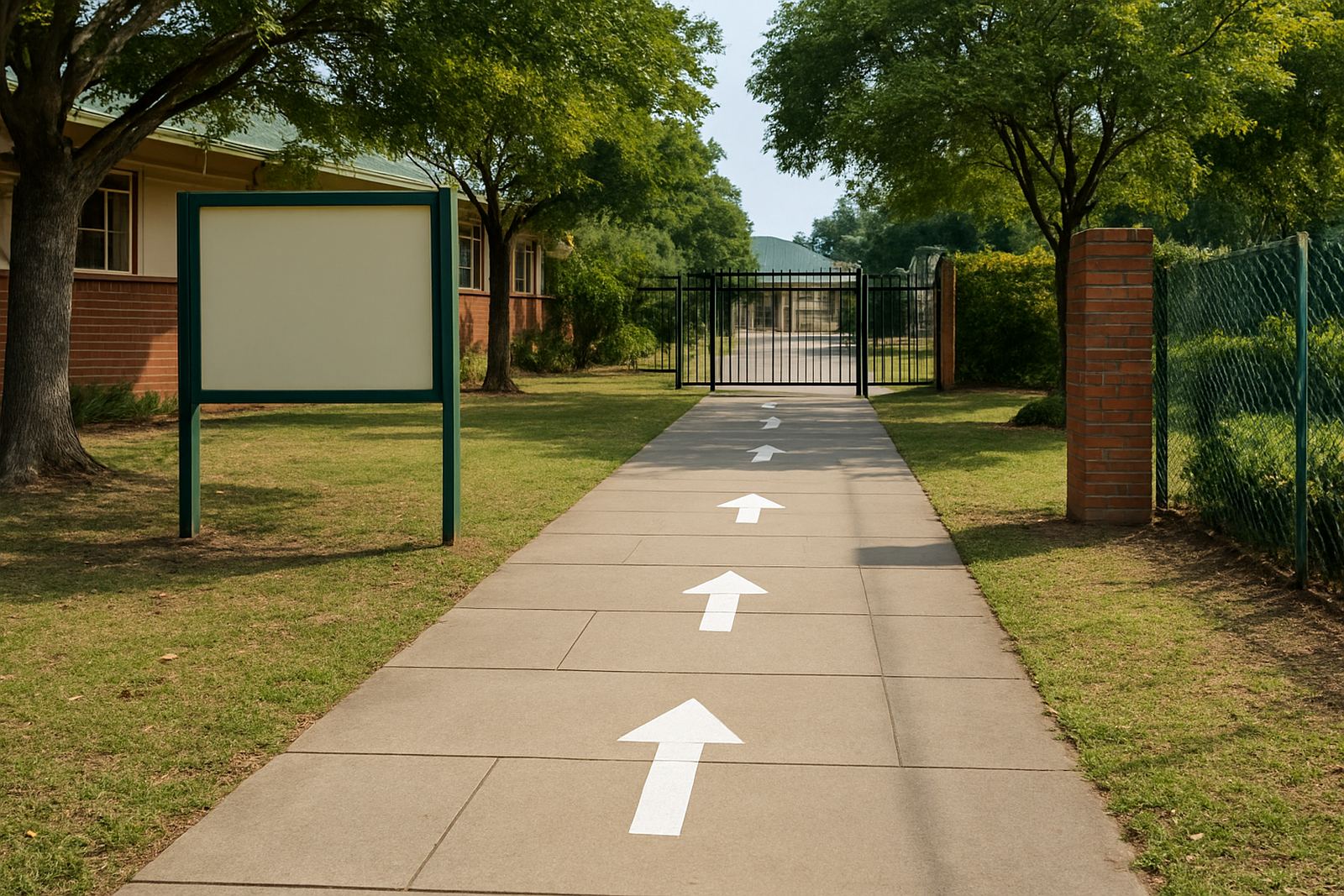
For directional signs, spacing also supports quick decisions. A person looking for reception, parking or a loading bay does not want to puzzle out the wording. Keep the route clear and use enough open space around arrows so they stand out. It sounds basic, but basic is what works.
5. Material choice changes how well a sign reads
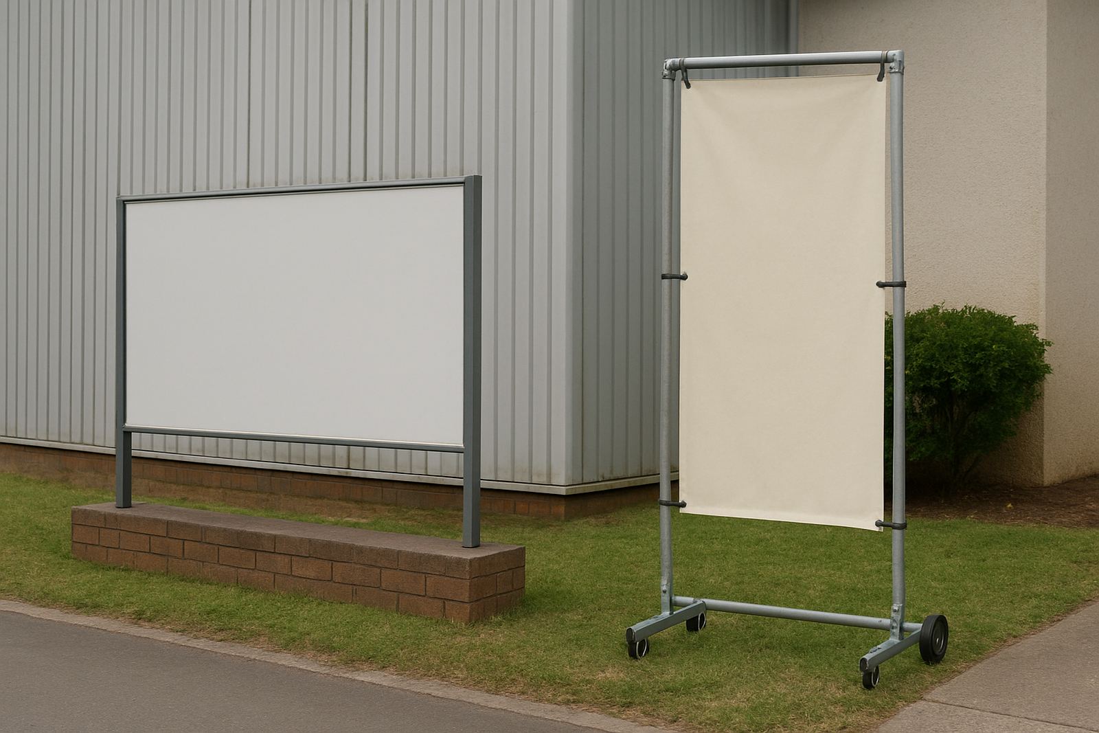
The same artwork can perform very differently on vinyl, Chromadek, Perspex or a light box. A sign that is easy to read on a flat file may look weak once it is fixed to a textured wall or fitted behind glass. That is why material choice is part of readability, not only part of fabrication.
For outdoor signs in eThekwini, materials must handle sun, wind and frequent rain. For shopfronts in Pinetown or Umhlanga, a sign may also need to sit beside competing visuals, vehicles and pedestrian traffic. In some areas the sign has to work at close range, while in others it must be read across a parking area or from the roadside. We look at the site, the mounting height and the background before recommending the sign type.
- Chromadek works well for weather exposure and larger panels
- Perspex suits clean fascia signage and illuminated displays
- ABS is useful for shaped lettering and detail
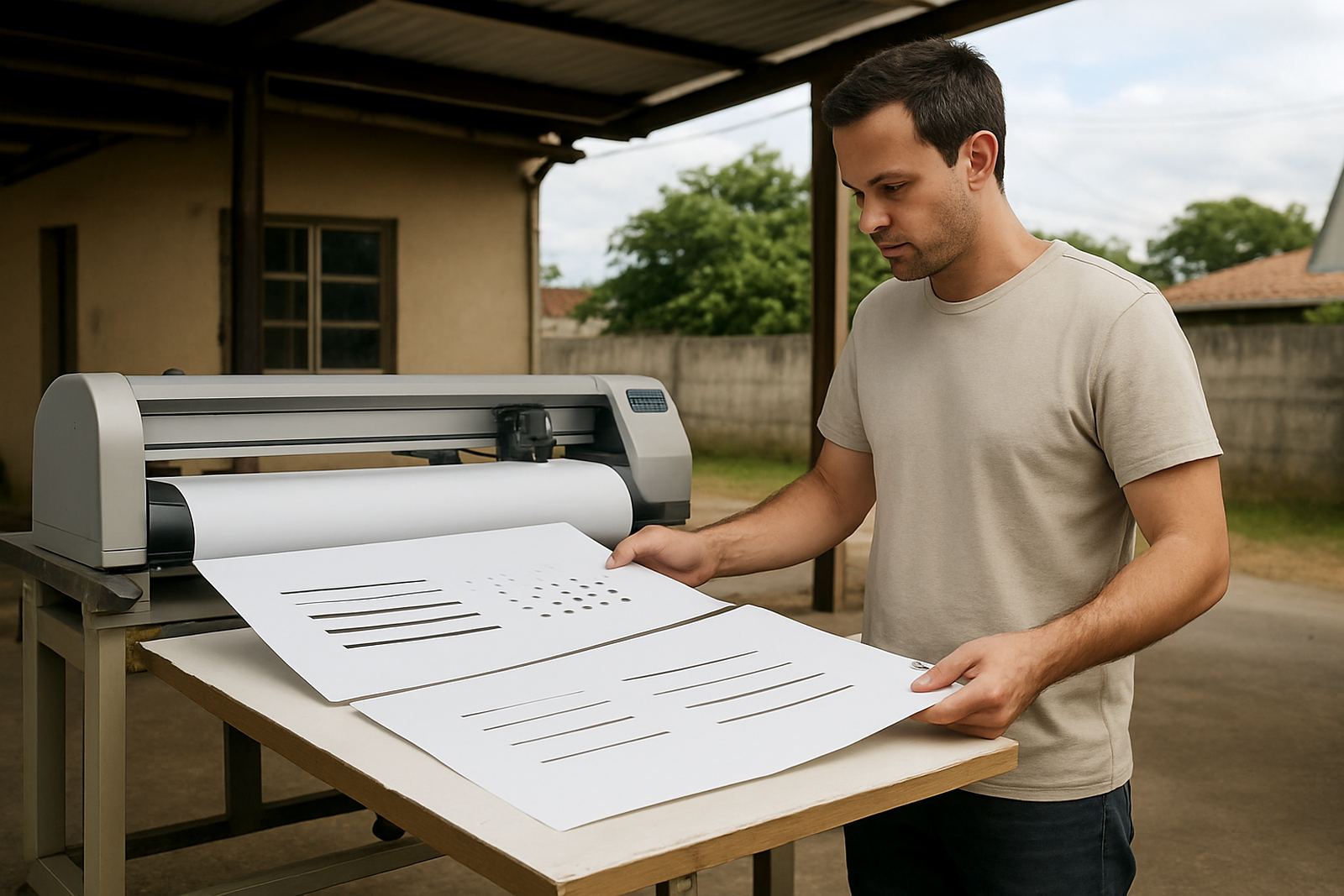
- Vinyl is practical for glass, walls and vehicle branding
6. Local conditions in Durban change the way people read signs
Durban weather is part of the design brief. Bright sun, humidity, sea air and afternoon rain all affect how a sign looks after installation. On the North Coast, reflective glare can make poor contrast even worse, while in busier inland areas the problem is often movement and distance. A sign that survives these conditions and still reads well is doing its job properly.
We often see this on shopfronts around Briardene and Durban North where people want a clean corporate look but still need quick recognition from passing traffic. In a real example, a small retail outlet with too much text on the fascia could not be read from the entrance lane. After simplifying the wording, increasing the letter height and improving the contrast, the shop name became visible much earlier. It was a small change but it made a proper difference.
Load-shedding can also affect illuminated signs, so it helps to plan for visibility without relying only on power. Reflective elements, careful placement and clean contrast all support readability when the lights are off or dim. That is one reason practical sign design should always include the real operating conditions, not just the artwork approval.
7. Maintenance keeps readability from fading away
Even a well-made sign can lose clarity if it is dirty, faded or damaged. Dust, salt film and ageing vinyl all reduce contrast over time. On window graphics, scratches and peeling edges make text harder to read. On shopfront signs, loose fittings or faded panels can give the wrong impression before a customer even walks in.
Regular maintenance visits are worth it, especially for exposed signs and busy sites. A quick inspection can catch lifting edges, cracked panels, faded sections or lighting issues before they become a bigger repair. Sign refurbishment and sign removals are also part of keeping a site tidy and legal, especially when trading names change or old panels need to come down safely.
If a sign no longer reads clearly, it is not doing the job you paid for. Sometimes a light clean is enough. Other times the artwork needs to be adjusted, the material replaced or the layout simplified. Either way, readability should stay on the checklist long after installation.