Start With the Message People Must Catch in 3 Seconds
On the road, nobody is stopping to study your vehicle. They are seeing it while merging, waiting at robots, or pulling out of a parking bay in Umhlanga or Pinetown. That means your branding should carry only the details that matter most: who you are, what you do, and how to recognise you again.
Keep the main message short. A company name, service type, and a contact route is usually enough for most fleets. If you try to fit in every product line, every suburb, and every award, the design becomes hard to read and the vehicle loses impact. The aim is quick recognition, not a full brochure on wheels.
- Put the company name where it can be read first.
- Use one clear service line, such as signage, courier work, maintenance, or installations.
- Include one contact route only if there is space, usually a website or enquiry form.
- Leave breathing room around the text so it does not look crowded.
Choose the Details That Stay Readable in Traffic
The best fleet decals use a simple layout with strong contrast. White on dark paint, black on light paint, or a colour that stands away from the bodywork works well. Thin script lettering and long sentences are difficult to read when a vehicle is moving at 60 km/h, especially in bright coastal light where glare can wash out fine detail.
Use larger lettering for the essentials and smaller text only for secondary items. A vehicle that operates between Briardene, Durban North, and the KZN North Coast may also spend time in the sun all day, so the finish has to hold up under heat, humidity, and salt air. That means the artwork should be planned with durability in mind as well as looks.
- Keep the business name large and bold.
- Use one or two support lines, not five.
- Avoid very thin fonts that disappear at a distance.
- Choose colours with high contrast against the paintwork.
What to Include on the Side Panel, Bonnet, and Rear Doors
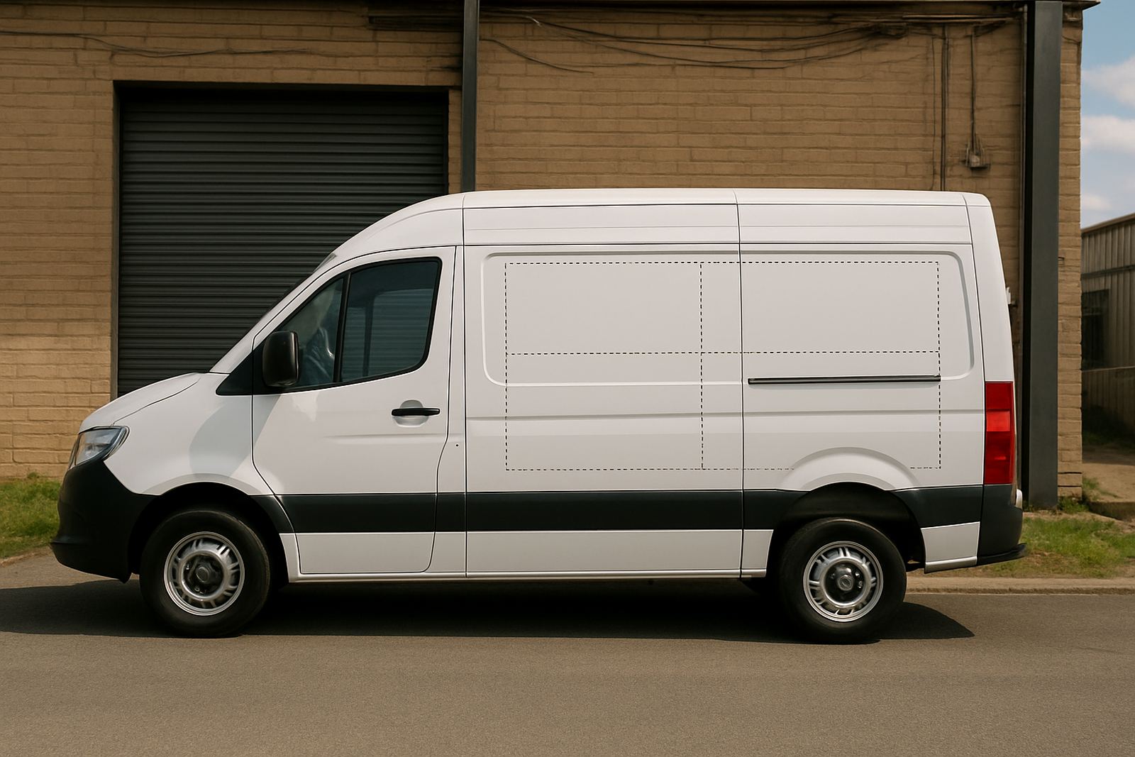
Different parts of a vehicle do different jobs. Side panels are the best place for your main brand name and service line. Bonnet branding is useful for visibility in parking areas and site entrances. Rear doors matter most in traffic, because following drivers see them for longer than they see the sides.
The rear of a van or bakkie should carry the clearest version of your details, since people often read it while waiting behind you. That is the right place for a simple web address, a short line about what you do, and any registration information that must appear. Keep in mind that panels, handles, curves and fuel caps can break up a design if they are ignored during planning.
- Side panels: brand name, service line, logo and a simple graphic treatment.
- Rear doors: contact route, website, and a short reminder of the service.
- Bonnet: a compact logo or name for front-facing visibility.
- Do not place vital details across seams or badly curved areas.
Match the Vinyl, Print, and Lamination to the Vehicle Use
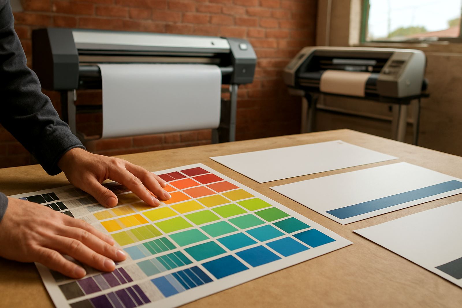
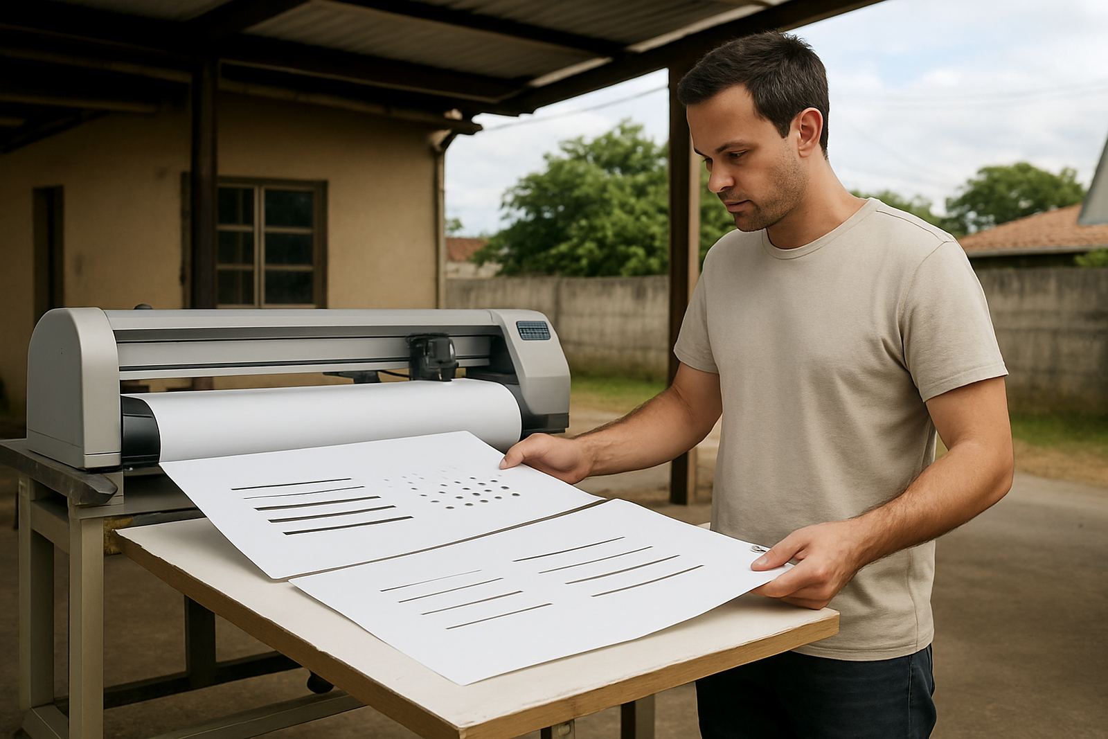
Not every vehicle gets the same treatment. A delivery van doing daily runs through the city needs a different finish from a service bakkie that visits sites once or twice a week. Vinyl cutting works well for names, numbers, and crisp lettering. Digital print is better for colour gradients, images, and larger artwork. Print lamination helps protect the finish from sun and regular washing.
If your fleet stays outside overnight, or if it operates near the coast, you need materials that can handle heat and moisture. Load-shedding also affects workshop planning, so production and installation need to be handled properly to avoid rushed jobs and poor alignment. A good fitment makes the decal last longer and helps it look neater for years, not just months.
- Use cut vinyl for clean text and simple logos.
- Use printed graphics where colour detail matters.
- Add lamination for extra protection against fading and abrasion.
- Plan installation around vehicle uptime so work does not disrupt deliveries.
Keep the Branding Legal and Practical on KwaZulu-Natal Roads
Vehicle branding should never block vision, number plates, lights, mirrors, or any markings required by law. It also should not create confusion for road users. If you are branding a mixed fleet, check that every vehicle still has clear identification where needed and that nothing interferes with safety. This matters on busy routes through eThekwini where quick lane changes and close following are part of daily driving.
Practical placement matters too. A decal may look fine in a photo but fail once the doors open or the tailgate lifts. Hinges, handles, trims, and tinted glass can all affect the final result. That is why site surveys and vehicle checks are worth doing before cutting the vinyl or printing the panels. A little planning saves rework later, and it keeps the fleet looking consistent.
- Do not cover lights, plates, mirrors, or required markings.
- Check that door openings will not cut through critical text.
- Make sure the design still reads when the vehicle is dirty.
- Keep installation neat around edges and joins.
A Durban Example: One Fleet, Clearer Road Presence
Think about a team running between Briardene, Umhlanga, Westville, and Ballito each day. A neat fleet can do quiet marketing every hour it is on the road. If the side panels carry a bold name, a service line, and one contact route, people remember it faster than if the vehicle is packed with too much copy. That is especially useful when the same bakkie parks outside estates, retail centres, and office parks where first impressions matter.
For a local business, the strongest result usually comes from keeping the design simple and repeating it across every vehicle. The cars, vans, and bakkies then look like one team, not a mix of unrelated units. Bongani Patrick Zulu and the team at BP Signs often see better results when clients choose clarity over clutter, because the brand stays visible even in heavy traffic or bad weather.
Checklist Before You Approve the Artwork
Before you sign off on any fleet decal, stand back and ask one simple question: would this still work if the vehicle was moving past you in two seconds? If the answer is no, trim it down. A clean layout helps your message survive real road conditions, from bright midday glare to evening rain and stop-start traffic.
Use this final check before production begins. It keeps the job practical and saves time when the vehicle comes in for fitment.
- Is the company name the most visible element?
- Can the design be read from a short distance?
- Are the colours high contrast against the vehicle body?
- Do the panels, doors, and curves suit the layout?
- Is there enough room for the essentials without crowding?
Good vehicle branding is not about filling space, its about making people remember you quickly and clearly.