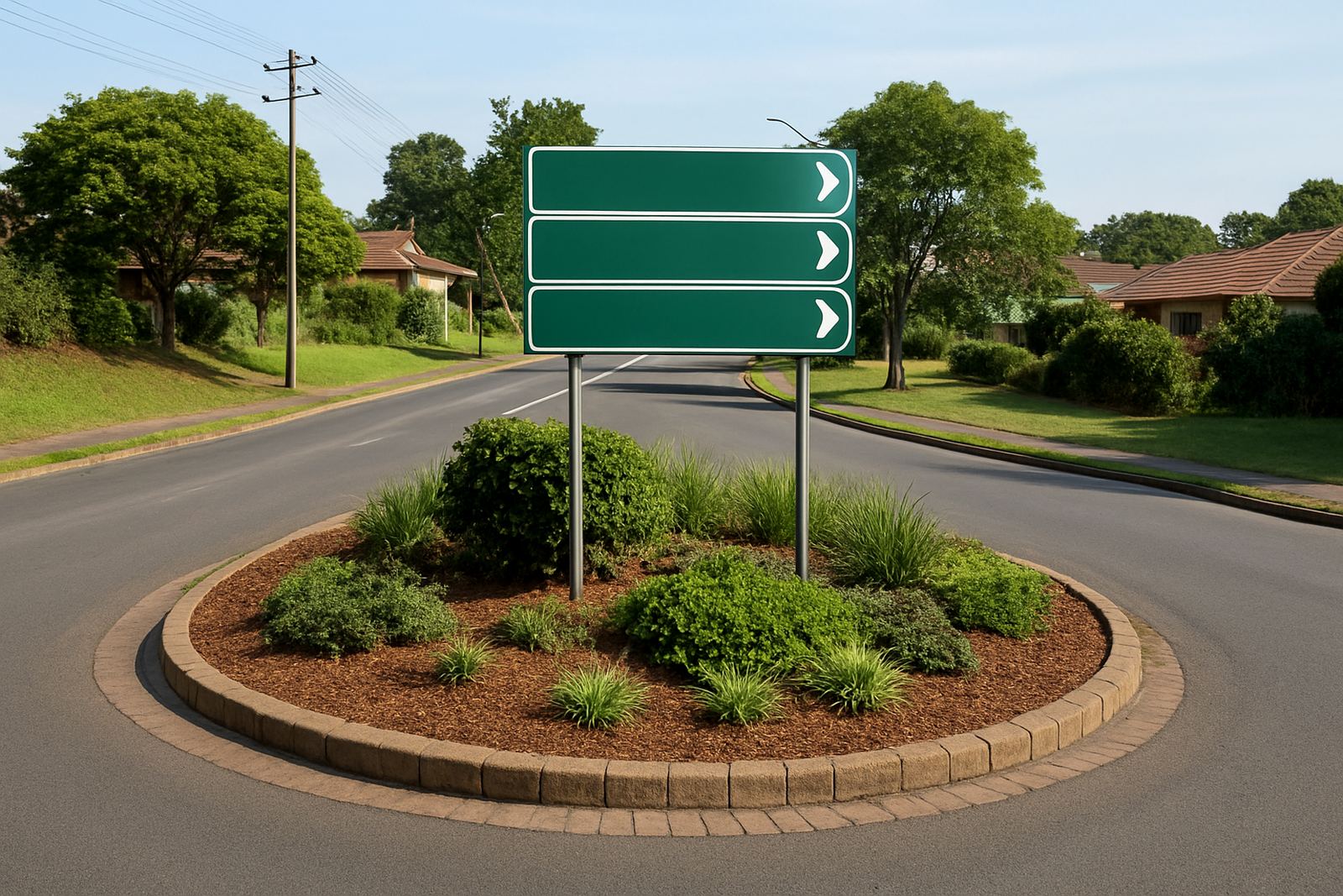
Start With A Simple Route Plan, Not A Sign Order
Good estate wayfinding starts before any sign is made. Walk the route from the main gate to reception, visitor parking, security, blocks, amenities and exit points, then note where drivers slow down, turn or often ask for help. In a busy estate in Umhlanga or Pinetown, the problem is usually not the lack of signs, but too many competing messages in one place.
Keep the route plan tight. One message per decision point is usually enough. If a driver must make a left turn, a stop, then another turn within a short distance, the signs should follow that sequence in the same order every time. Mixed wording like Visitor Parking, Guest Bay and Visitors Only on the same route creates confusion and looks untidy.
For larger estates, a site survey helps identify where signs need to be mounted high enough for visibility yet low enough to read from a car. That balance matters in areas with short sight lines, bends and landscaped entrances.
Use A Consistent Naming System Across The Estate
Wayfinding looks cleaner when every location is named in one standard way. If one entrance says Block A and another says A Block, or one sign uses Parking Bay while another uses Visitor Bays, the system starts to feel patchy. The best estates keep naming aligned across all boards, maps and directional markers.
- Use the same terms on all signs, maps and security notices
- Keep abbreviations to a minimum unless they are widely understood
- Match block numbers, street names and parking zones exactly
- Use the same font family and letter spacing throughout
In coastal Durban, consistency also helps when signs need replacing later. If one board is damaged by wind or sunlight, a like-for-like replacement is easier when the original wording, sizes and colours were properly recorded.
A clean naming system also helps visitors who are not familiar with local shortcuts. A person coming in for the first time should not need to guess whether East Court, Eastcourt and Court East are the same place.
Choose Materials That Handle Heat, Salt Air And Cleaning
Estate signs in Durban North, Ballito and Tongaat must cope with sun, moisture and salt in the air. The wrong material can warp, fade or lose adhesion long before the rest of the estate looks tired. For permanent directional signs, rigid boards, face panels, printed graphics and mounting hardware should all be selected with the environment in mind.
Light boxes, Perspex face panels and Chromadek signs are often used for entrances and key directional points where visibility matters after dark or during load-shedding. Vinyl graphics are useful for arrows, labels and updates, while laminated print helps protect against fading and surface wear. Window frosting and contra-vision can also be useful for office fronts, guard rooms and access control points where privacy is needed without blocking light.
- Use UV-resistant print and lamination on exposed boards
- Choose fixings that suit coastal conditions and regular cleaning
- Avoid tiny text that becomes hard to read from a moving vehicle
- Allow for maintenance access if a sign may need repainting or replacement
If the estate uses reflective or backlit elements, check how they perform at night and during cloudy afternoons. A sign that looks fine in the workshop may disappear once it is mounted near strong glare, dark paving or dense planting.
Keep Fonts, Colours And Arrows Easy To Read At Speed
Most estate directional signs are read from a car, often while the driver is turning or watching for pedestrians. That means legibility matters more than decoration. Clear contrast between background and text, strong arrow shapes and a consistent visual hierarchy will usually do more for the estate than fancy graphics.
Use one main font style across the system and avoid too many weights or decorative effects. Light text on a dark background can work well, as can dark text on a pale background, but the contrast must stay strong in bright sun and shade. Arrows should point exactly where the route goes, not just roughly in that direction.
When an estate has different user groups, such as residents, guests, couriers and contractors, colour coding can help if it stays simple. One colour for visitor routes, another for service access and a separate indicator for pedestrian walkways is usually enough. Too many colours quickly become hard to follow and can make the site look cluttered.
At night, especially in estates that want low power use during outages, reflective details or illuminated signs can help guide movement safely without overloading the electrical setup.
Place Signs Where Drivers Actually Make Decisions
Placement is often where a neat system succeeds or fails. A directional sign hidden behind a tree, mounted too close to the turn or positioned beside competing notices will be ignored. Signs should be visible before the driver needs to act, not after. In practical terms, that usually means placing them on the approach to the decision point, with enough space for a safe response.
Security gates, stop streets, pedestrian crossings and visitor parking entrances are the most important points to get right. If a sign is intended for people walking rather than driving, it should be mounted lower and used where foot traffic naturally slows down. For vehicle routes, the sign should be clear enough to read without stopping in the wrong place.
In a Durban estate with mature trees and sea breeze movement, branches and hanging signage can shift sight lines over time. That is why the installation plan should account for seasonal growth, pruning schedules and even delivery truck height. A sign that works in winter may be partially blocked by summer foliage if nobody checks it.
- Mount signs before the turn, not on top of it
- Check visibility from both day and night approaches
- Avoid placing signs behind gates, poles or dense planting
- Keep pedestrian signs separate from vehicle guidance where possible
Plan For Refurbishment, Removals And Small Changes
Estate wayfinding is not a once-off job. Unit numbers change, parking rules get updated, and new facilities are added over time. If the signage system was planned properly, changes can be made without making the estate look patched together. That means keeping records of sizes, materials, mount points and wording from the start.
Maintenance visits are worth scheduling before signs become hard to read. A faded arrow, loose panel or stained face creates confusion and makes the whole estate look neglected. In coastal conditions, routine checks are especially useful after heavy rain, strong wind or prolonged sun exposure.
When a sign is no longer needed, it should be removed cleanly and the surface restored where needed. Old adhesive, damaged drill holes and mismatched replacement boards are the usual signs of a system that was never documented properly. Refurbishment is easier when the estate keeps one supplier or one team informed about the full layout.
For estates across eThekwini, Umhlanga, Pinetown and the North Coast, the best approach is simple: design for clarity, install for the real route and maintain it before problems build up. That keeps the estate tidy and makes it easier for residents, visitors and service vehicles to move with confidence.
A Practical Durban Example For Shared Access Estates
Consider a mixed-use estate in Durban North with a main entrance, two apartment blocks, a clubhouse and visitor parking. The most useful system would start with one strong entrance sign, then a clear fork: residents to the left, visitors straight ahead, service vehicles to the rear. From there, each route would repeat the same colour, wording and arrow style.
If the estate also has office tenants or a small retail component, keep those signs separate from residential directions so people do not end up in the wrong zone. A clean sequence helps security staff as well, since fewer drivers need to stop and ask where to go. The result is calmer traffic and less wear on the entrance area.
In this kind of setup, the best signs are usually simple, durable and easy to replace. That might include vinyl cut lettering on rigid boards, printed panels with lamination, window frosting for office areas and a light box where night visibility is important. The exact mix depends on the site, but the goal stays the same: clear movement, one message at a time.