A Restaurant Refresh for a Busy La Lucia Site
The client was a food outlet in La Lucia, Durban North, trading in a busy coastal centre where first impressions matter before a customer even steps inside. The brief was straightforward but practical: sharpen the shopfront, improve menu visibility, and give the entrance a more organised look without slowing down daily service.
The site already had foot traffic from nearby offices, residents and evening diners, so the signage had to suit both quick lunch stops and later trade. We were asked to combine three elements into one clean package, namely menu boards, light box signage and entry graphics, all sized to work with the existing wall space and front glazing.
Because restaurant operations could not stop for long, the project had to be planned around trading hours. That meant measuring carefully, preparing the artwork in advance and scheduling installation in a short window so the outlet could keep serving with minimal disruption.
The Brief, Site Limits and Coastal Conditions
La Lucia sites deal with strong sun, reflected glare and coastal humidity, so material choice mattered just as much as layout. The client wanted signage that stayed readable in bright daylight, held up in a humid setting and could cope with regular cleaning around the entrance and counter area.
The wall area above the service point was not large, and the entrance glazing needed to remain open enough for natural light. That ruled out anything bulky. We also had to work around existing fittings, a narrow access point for installation and the need to keep the front neat while staff were preparing for service. On top of that, any illuminated sign had to be practical during power cuts, so the design needed to still make sense when the lights were off.
- Limited wall depth for the light box frame
- Existing fascia and glazing already in place
- Short installation window between trading periods
- Coastal exposure and moisture near the entrance
What We Supplied and Installed
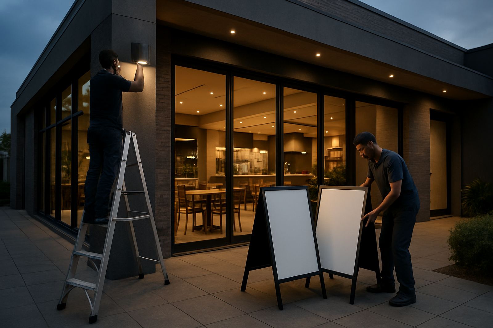
We provided a coordinated sign package built around daily use. The menu boards were produced for clear reading at counter height, with a simple layout that kept item names, pricing and section headings easy to scan. The light box was fabricated for the main frontage, using a slim profile so it sat neatly against the wall without looking heavy. Entry graphics were added to the glass to define the doorway and reinforce the restaurant identity from the pavement side.
For the printed elements, we used large format printing with lamination where needed for better surface protection and easier wipe-down maintenance. Vinyl cutting was used for the lettering and directional information, while the light box face was prepared for even illumination. The entry graphics included frosted and opaque areas to balance privacy with visibility, especially useful when the outlet was busy and staff movement behind the glass needed to be softened rather than hidden completely.
Our installation team handled the fitment on site, with final alignment checked against the counter line and the entrance frame. The job also included tidy finish work around the edges so the signs looked built-in, not added as an afterthought.
- Menu boards sized for quick reading from the queue
- Light box frontage for stronger night-time visibility
- Vinyl-cut entry graphics and glass branding
- Protective lamination on high-touch printed sections
Artwork Setup and Production Control
Before anything went into print, we prepared the artwork to suit the site measurements and the way customers move through the space. That included checking font sizes for legibility, spacing the menu items so they did not feel cramped, and setting the colour breaks to keep the branding sharp against the restaurant interior. Priya Govender handled the graphic setup, while Sashen Naidoo oversaw production checks before fabrication began.
The advantage of doing the artwork properly is simple: the sign behaves better once installed. In a restaurant, small design errors can make a board hard to read under warm lighting or cause glare on gloss surfaces. We adjusted for that by using clean contrasts, reducing unnecessary detail and keeping the entry graphics readable from a short walking distance. Noluthando? No, this site needed no visual noise, just tidy information and a confident finish.
- Artwork scaled for the final viewing distance
- High contrast copy for easier reading indoors
- Colour matching to existing interior finishes
- Production checks before cutting and printing
Installation in Two Weeks with Minimal Disruption
The full project ran over two weeks from measure-up to handover. Week one covered the site survey, measurements, artwork approval and production. Week two covered fabrication, print finishing and installation. Because the outlet was trading, the fitting was scheduled to avoid the busiest service periods and to keep dust and mess to a minimum.
Anele Dlamini led the installation on site, working with the team to set the light box level, align the menu boards and apply the entry graphics cleanly to the glass. The work was completed in one coordinated visit after prep work was done off site. That approach reduced downtime and allowed staff to reopen with the new signage in place by the end of the job.
For a restaurant, timing is often the difference between a good result and a stressful one. The client needed the refresh done quickly, but not carelessly, and that is exactly how it was handled.
Results, Maintenance and What We Would Repeat
The result was a cleaner frontage and better menu visibility, especially for customers arriving in the late afternoon or after dark. The light box gave the restaurant stronger street presence, while the entry graphics made the glass easier to read and helped the entrance feel more intentional. The menu boards now support quick ordering, which matters when the queue moves fast and staff need the information close at hand.
From our side, this is the kind of project we would repeat without changing the basics: precise survey work, plain language artwork, durable materials and a short, well managed installation plan. For restaurants in La Lucia, Umhlanga or elsewhere along the Durban coast, that combination is practical because it keeps the sign neat, legible and easy to maintain. If the client wants future updates, we would handle refurbishment, sign cleaning support and panel changes without disturbing the entire frontage.
Bongani Patrick Zulu and the BP Signs team use the same approach on food outlets across eThekwini, from a single menu board to a full shopfront package. The aim is not only to make it look good on day one, but to keep it working through regular trade, sea air and load-shedding interruptions.
Key facts
| Project | La Lucia Restaurant Signs |
|---|---|
| Client type | Food outlet in La Lucia, Durban North |
| Scope | Menu boards, light box signage and entry graphics |
| Materials | Large format print, vinyl cutting, laminated graphics, illuminated sign face |
| Timeline | 2 weeks from site survey to installation |
| Service area | La Lucia, Durban North and nearby eThekwini suburbs |