Start with the signs people need on day one
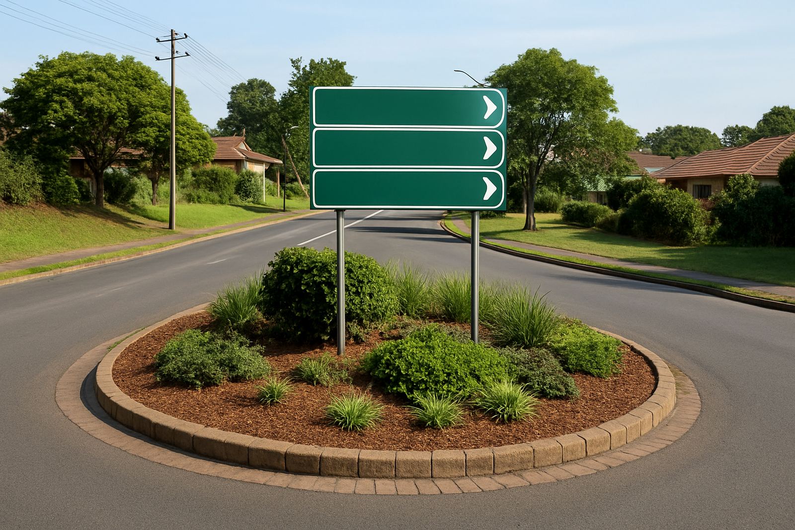
Office branding works best when it solves the basics first. Visitors should know where to park, where to sign in, which lift to take and where reception is without asking three different people. In a busy Durban office, that often means a clean entrance sign, reception branding, directional panels and room identification that matches the layout of the building.
At BP Signs, we usually begin with a site survey so the signs fit the actual movement of the space, not just the floorplan. That matters in multi-tenant buildings and shared entrances where you need signage that respects building rules, fire routes and the body corporate requirements. A sign that is easy to read from 3 to 5 metres is often more useful than a large decorative panel with too much text.
- Reception name panels
- Directional arrows for corridors and lifts
- Meeting room and office name plates
- Toilet, exit and fire route signage
- Parking bay or visitor bay identification
Use materials that suit humidity, cleaning and daily traffic
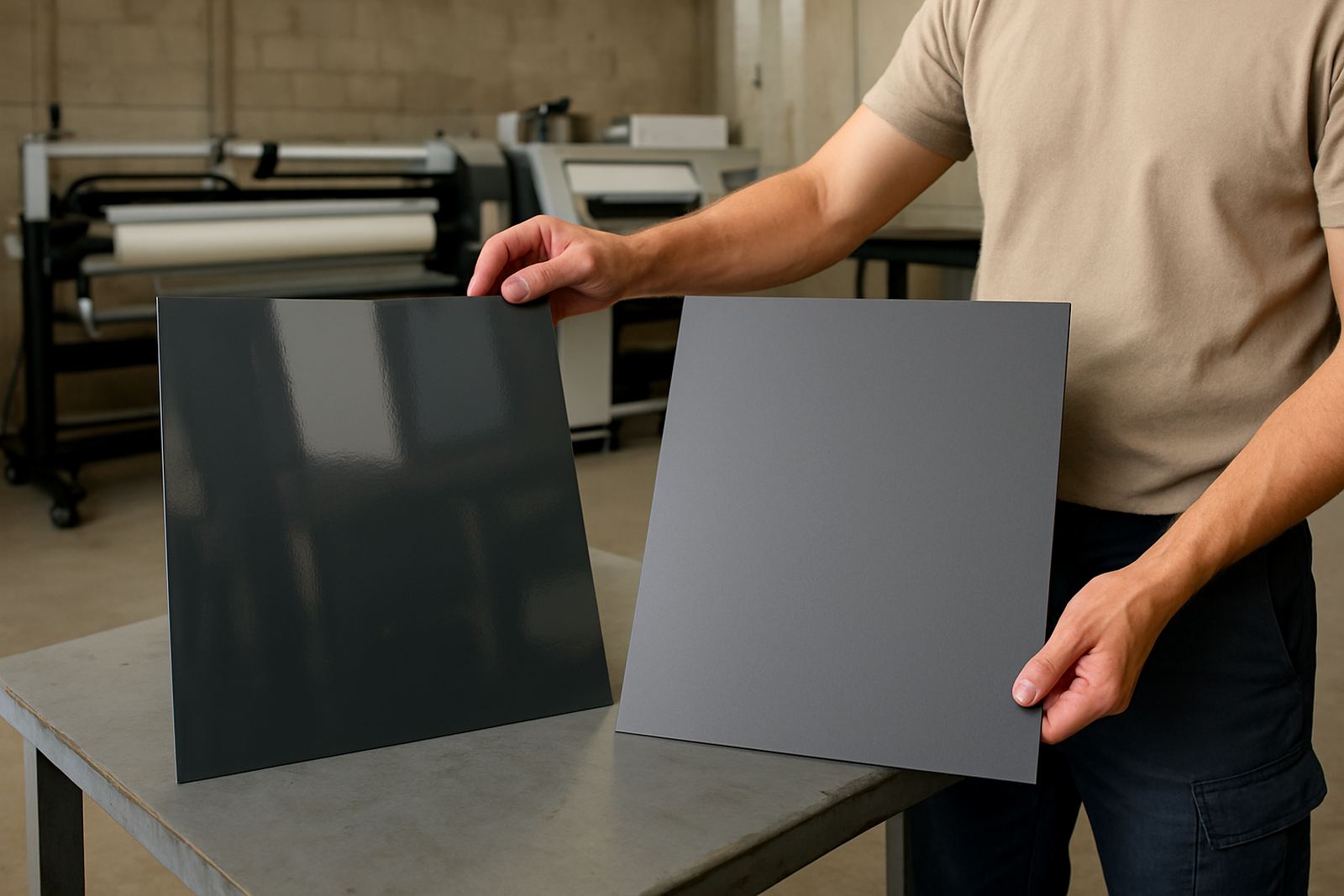
Durban offices deal with humidity, salt air in coastal areas and regular cleaning, so the material matters. For interior branding, acrylic, Perspex, printed vinyl, frosted film and composite panels are common choices. If a sign is going into a reception area with aircon and glass, frosted film or printed vinyl can give a neat finish without taking up floor space. If it needs to be moved later, lighter panels make life easier.
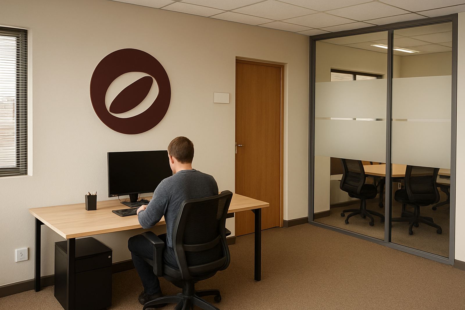
For larger identity signs inside a boardroom, lobby or shared passage, we often recommend fabricated lettering, light boxes or layered panels depending on the effect needed. Lamination is important too, especially where staff touch the sign or where cleaning happens often. It helps the print last longer and keeps colours looking fresher, which is useful in a space that needs to stay presentable every week, not just on opening day.
- Frosted film for privacy on glass offices
- Printed vinyl for branded walls and internal doors
- Perspex and acrylic for clean modern wayfinding
- Light boxes for visible reception branding
- Laminated graphics for wear and regular cleaning
Make the layout easy to follow without overloading the walls
Good office branding does not mean every wall must carry a logo. Too much signage makes a space feel busy and can confuse people, especially in long corridors or open-plan offices. A better approach is to use a clear visual system. Keep colours consistent, use one font family, and repeat the same arrow style and room naming across the site.
This helps visitors understand the office quickly, and it helps staff too. A new client arriving for a meeting in Umhlanga should be able to find reception, then the meeting room and then the correct exit without needing help at every turn. The same applies in industrial office parks in Pinetown or along the North Coast where tenants share entrances and parking areas. Clear signs reduce interruptions, which makes the whole office feel calmer and more organised.
One practical tip is to keep the wording short. “Accounts”, “Boardroom 1”, “Private Meeting Room”, “Staff Only” and “Exit” usually work better than long descriptions. If people must stop and read the sign twice, the sign is already doing too much.
Privacy and presentation can work together on glass and partitions
Open-plan offices look modern, but glass meeting rooms and front-facing offices can create privacy issues. Window frosting and contra-vision are useful here because they let light through while giving staff some screen from passers-by. In reception areas, this can help with confidentiality at the front counter and make the whole space look more organised.
Frosted graphics are also useful for adding branding without making the room dark. A logo, line pattern or department name can be cut into the film so the glass still feels open. Contra-vision works well where you want a printed exterior look but still need some visibility from inside. That can be handy in offices near busy roads or shared walkways where there is a lot of movement outside.
- Reception privacy without blocking natural light
- Meeting room branding with a cleaner finish
- Glass partition identification for staff and visitors
- Reduced distraction in street-facing offices
- Better balance between openness and privacy
Think about maintenance from the start, not after the damage shows
Office signs are not set-and-forget items. They need to stay legible, clean and fixed in place. In a commercial building, scuffed corners, peeling vinyl or fading prints give a poor impression even if the office itself is well run. That is why refurbishment, maintenance visits and sign removals matter just as much as the original installation.
If a department changes names, if a lease ends or if a tenant moves out, the signage should be updated quickly. We often see offices where old directory panels are still in place, which causes confusion for visitors and delivery drivers. A clean replacement is usually cheaper than leaving outdated information on the wall for months. It also avoids awkward mistakes when contractors or clients arrive at the wrong room.
For offices with regular staff changes, it helps to use systems that are easy to update. Removable inserts, vinyl panels and modular room signs save time later. That way the office can grow or change without starting from scratch every time. It's a small detail but it keeps the space looking current.
A Durban example: one reception, one route, one clear message
Imagine a small professional office in Briardene serving clients from Durban North, Umhlanga and Westville. The entrance has a glass door, a waiting area, two meeting rooms and a corridor leading to admin and operations. Without clear signage, visitors wander, staff get interrupted and the reception area carries too much work.
A simple branding plan could include frosted film on the front glass, a reception logo panel, directional signs to the meeting rooms, clear room names and a neat wall graphic in the client waiting area. If vehicles or equipment are being installed at the same time, the same visual style can carry through to the shopfront or car park bays. That consistency makes the business look settled and organised before anyone even sits down.
For many KZN offices, the best result is not flashy. It is practical, tidy and easy to keep in order. When signage is planned properly, staff spend less time giving directions and visitors feel more confident from the first few minutes.
Keep the message short and the finish clean
Office branding ideas do not need to be complicated. Start with wayfinding, add privacy where needed, then bring in the brand colours and logo in the places that matter most. If the office is easy to move through, easy to read and easy to maintain, the branding has done its job.
For Durban businesses, local conditions matter. Coastal humidity, bright sunlight through glass, busy shared buildings and load-shedding all affect how signs perform and how often they are seen. A practical signage plan takes all of that into account and still leaves the office looking professional, which is what clients notice first.
BP Signs works from Briardene, Durban North, and handles site surveys, artwork setup, large format printing, vinyl cutting, fabrication, installation and maintenance across eThekwini, Umhlanga, Pinetown and the KZN North Coast. When the office needs to look clearer and work better, a few well placed signs can make a bigger difference than most people expect.